Thursday, July 16, 2009

What does an art historian read?

Some people read with intensity and focus; they commit to a single book and methodically read it until it is finished, and once finished, they start another book. I admire these people.

I read frantically and in spurts, as though the book will be taken away from me after a short amount of time. I'll read half the book in 24 hours, and then not look at it for two weeks. If I'm in the midst of a project (which is always) then I'm constantly flipping through and reading sections at a time based on the book's current relevance to my project. Or if I'm looking for a methodology, then I'll try to commit to an entire book and read it all at once, but I usually suck at doing this. And because I read for a living, it's hard to just kick back and read for pleasure after plowing through dense academic language/ideas. Sometimes (usually?) television wins out in that case. Or I'll read utter crap because it's easy to read and I can finish it in less than 48 hours (see my "just finished" list below).

Books from undergrad, books from grad school, free textbooks from publishing companies, books given as gifts, books bought on a whim in an airport, and books that I'm not entirely sure how they came into my possession; fiction, non-fiction, biography, novels, poetry, textbooks, books entirely composed of pictures, playbooks (football), playbooks (theater), anthologies; brochures, magazines, journals, photocopied articles, articles printed from the computer.

My reading materials have engendered romantic gifts: one year, my fiance bought me a bookcase for Valentine's Day. With the help of my landlord, he snuck into my apartment and I came home to a fully-assembled bookshelf so my books that were spilling out of my sad, collapsible bookcase could rest on the shelves. (It remains as one of my most-used and favorite gifts!) Another year, as a "beginning of the school year" gift, he bought me a filing cabinet to put all my looseleaf articles.

Currently reading for research and work-related projects (alphabetical by author):
  • "Hard Hats and Art Strikes: Robert Morris in 1970" by Julia Bryan-Wilson, Art Bulletin (June 2007)
  • Farewell to an Idea: Episodes from a History of Modernism by T.J. Clark
  • The Rise of the Sixties by Thomas Crow
  • Modern Art in the Common Culture by Thomas Crow
  • A Cultural History of Fashion in the 20th Century: From the Catwalk to the Sidwalk by Bonnie English
  • Bourgeois Utopias: The Rise and Fall of Suburbia by Robert Fisher
  • Crabgrass Frontier: The Suburbanization of the United States by Kenneth T. Jackson
  • Minimalism: Art and Polemics in the Sixties by James Meyer (a re-read, review coming soon!)
Currently reading for fun (alphabetical by author)
  • American Lion: Andrew Jackson in the White House by Jon Meacham
  • Harry Potter and the Half-Blood Prince by J.K. Rowling (a re-read in preparation for the movie!)
Just finished:
  • Wheel of Darkness by Douglas Preston and Lincoln Child (I'm a little ashamed of this one because it is TERRIBLE, the literary equivalent of cotton candy - fluffy and not at all nourishing!)
On my to-do list (alphabetical by author):
  • Twelve Views of Manet's Bar by Bradford Collins
  • "Everyday Life in Motion: The Art of Walking in Late-Nineteenth-Century Paris" by Nancy Forgione, Art Bulletin (December 2005)
  • 1776 by David McCullough
  • John Adams by David McCullough
And in my Amazon.com "Saved Items - To Buy Later" cart, a mixture of pleasure and work reading (alphabetical by author):
  • Bernini and the Birth of Baroque Portrait Sculpture ed. Andrea Bacchi
  • Still-Life and Trade in the Dutch Golden Age by Julie Berger Hochstrasser
  • The Painting of Modern Life by T.J. Clark
  • The Columbia Guide to American in the Sixties ed. by David Farber
  • Absorption and Theatricality: Painting and Beholder in the Age of Diderot by Michael Fried
  • Courbet's Realism by Michael Fried
  • How We Got Here: The 70s, the Decade That Brought You Modern Life (For Better or For Worse) by David Frum
  • The Embarrassment of Riches by Simon Schama
  • The Seventies: The Great Shift in American Culture, Society and Politics by Bruce Schulman
  • Portraiture by Shearer West
People have come to our apartment and been amazed by my books. Usually, they glance at the shelves, then later linger over the titles, and then eventually ask, "Have you actually read all these books?" Well, kinda.

We are acutely aware of how our reading material shapes people's perceptions of us. This article discusses how the Kindle disguises subway readers' books, thus being unable to let the entire car know that you are reading The Essential Kierkegaard. Conversely, it also lets you hide the fact that you are reading The Wheel of Darkness.

So for you, dear reader: what are you reading? Why are you reading it? How do you read? What do you prefer to read, and what do you prefer to not read? Imagine someone walked up to your bookshelf: what would that person surmise about your personality? Have you forced yourself to read something out of your comfort zone - and did you like it?

And bonus points: cull 4-5 books from my lists and propose a research topic and title of the paper. (This is a nerdy game I play with my art historian friends.)

How can one painting mean different things, and all be right?

Art historians deal with concrete facts: names, dates, places, provenance, materials, techniques. Supporting these facts is one real, tangible item: the actual work of art. Between these two concretes lies a great deal of space for interpretation. In my experience, students see a work of art and expect it to have a single, concrete meaning that answers any and all questions about the work: Leonardo's Last Supper is the Last Supper, Michelangelo's David is "only" the sculptural illustration of the Biblical David and sign of Florentine pride, Monet's Impression, Sunrise is just the "impression" of a scene.

What takes students a longer time to learn is that art history is often about holding diverse, and sometimes conflicting, ideas simultaneously. Not only is that a delicate balancing act, but then art history asks students to use those ideas as a foundation for their own analysis. Adding to students' difficulties is that art historians specialize in methodologies: iconography, feminism, Marxism, New Art History, biography, etc. Think of these methodologies as a lens that color perception of a work of art. To one art historian, Titian's Venus of Urbino is a nude representative of a way for artists to make money in addition to religious commissions: marriage pictures and softcore porn for the wealthy. To another art historian, the very act of drawing and purchasing a picture of a nude woman is akin to the prostitutes modeling for Titian, both painting and woman can be bought and sold. (No self-respecting wealthy Venetian woman would have been posing nude during this time period!)

This post intends to introduce the casual reader to different types of art historical methodologies, and also to explore how different interpretations of the same facts can be "right."

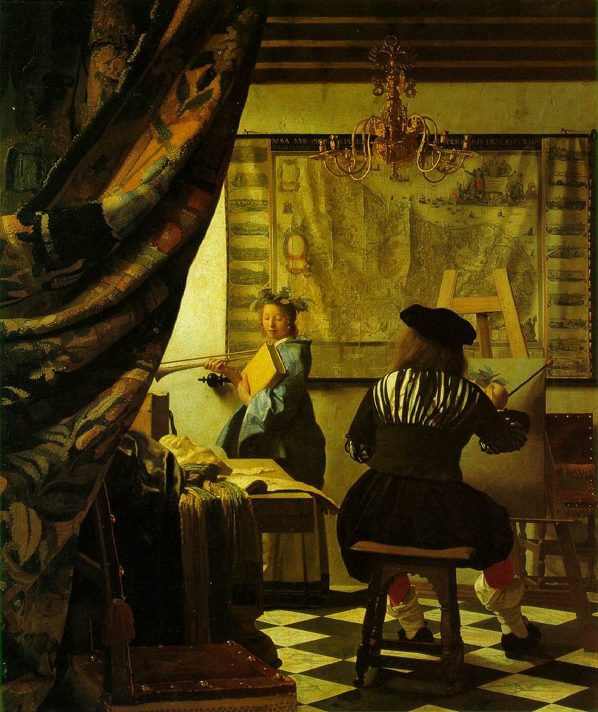
We start by looking at this painting by Vermeer:

Johann Vermeer, The Art of Painting, c. 1662-1668, oil on canvas, approx. 29" x 25."
Kunsthistorisches Museum, Vienna


Vermeer shows an artist sitting at his easel painting a model. The artist and easel are located on the right half of the canvas, and the left half is crowded with a cluttered table, and behind the table, the artist's model. She holds a book and trumpet, and wears a blue dress and a wreath on her head. Vermeer has overlapped textures, colors, and patterns: the curtain at left, a tiled floor, the artist's red socks, the model's blue dress, a map on the wall. At left, closest to the viewer, a curtain is pulled back and the effect is as though the viewer is encroaching on a private scene. The glow of the light source from the upper left corner and hidden by the curtain reinforces this intimacy.

Vermeer historians and connoisseurs might focus on the curious light source: how it is obscured from the viewer, and how it ripples across the different objects/colors/textures in the room. They might note that the placement of the light source in the upper left corner is similar to Vermeer's other paintings (examples here and here). Renaissance historians may note the general rise during the Baroque of pictures of artists in their studios, the result of Renaissance artists striving to raise the status of the artist from craftsman to talented genius.

Conservators might examine The Art of Painting with scientific instruments and find out the whiteness of the back wall mixes lead white with alabaster and quartz. The inherent sparkle of quartz and the rough texture of the painting captures the cool light of Northern Europe both within Vermeer's scene, and then also when viewed in person - the light as it hits the canvas has a unique luminosity. Simultaneously, the painting is familiar to the 17th century viewer who is accustomed to the same light as Vermeer, and also charactertistic of Vermeer's eye for capturing the many dimensions of light and color.

The traditional interpretation of The Art of Painting examines the painting in terms of symbols: the model has the attributes of Clio, one of the original nine muses that also stood for Fame. Painters would use Iconologia by Cesare Ripa, printed in the Netherlands in 1644 and 1699, to find out what accessories to add to a figure so that the viewer would understand that it wasn't "just" a woman holding a trumpet with a wreath, but to stand for the abstract idea of Fame. Vermeer has included attributes that could remind us of an artist: black and white tile are symbolic of chiaroscuro, and the sketchbook of disegno. The map is symbolic of Dutch pride in their free nation (Dutch independence from Spain ocurred in 1634) and also their pride in their mapmaking, which was the best in the world. All of the symbols are housed in a cozy Dutch interior (a popular 17th century subject and a specialty of Vermeer's).

Altogether, this view sees the realities and act of painting, as Vermeer making a case for the higher status of the artist. The artist is both creator and interpreter, and gifted with the talent to draw and paint. In this interpretation, art history is similar to math: 1 + 2 + 3 = 6; all the symbols add up to one neat and tidy meaning that "explains" the painting's meaning, which otherwise looks like a regular genre scene. Since the Baroque, art historians have used symbolism to "decode" Dutch paintings; once decoded, these symbols create an overall message to the viewer.

More recently, eminent art historian Svetlana Alpers rejected this symoblic interpretation in favor of what she sees as the "mapmaking impulse." She views Vermeer's The Art of Painting as evidence of a broader context, the Dutch scientific vision for ordering knowledge and how that affected their worldview. Evidence supporting Alpers's vision are the various Dutch developments in the 17th century: the previously mentioned mapmaking industry (and subsequent naval prowess), and the invention of the microscope. Essentially, Alpers is proposing a new way to "read" a painting. Rather than decoding symbols to find an overall message, Alpers situates Vermeer's painting within the larger context of Dutch culture. Dutch Baroque artists, originally seen as realists, are now studying the idea of what can be real, rather than straightforwardly presenting reality.

So now what? We have different ways to analyze this painting: as part of Vermeer's entire oeuvre, evidence of Vermeer's innovative approach to pigmentation and light, Dutch realism, symbolis, and the Dutch "mapmaking" impulse. Which interpretation is right?

The answer: all of them!

Notice how all the above interpretations all rest on the same facts: artist, name, date, and place/style. Yet each of the facts about the period, artist, context, and the individual work of art can be read in several different ways. When beginning to weed through the amount of information and interpretations offered about a painting/artist/work of art, one should always begin with the concrete facts, and then a close looking at the concrete object. So long as an interpretation has solid facts as the foundation of the analysis, then a student shouldn't worry too much about what something "means."

The best paintings in the world are not what they "mean," but what they represent to many people. The best paintings in the world inspire countless interpretations because of the ambiguity, and inspire viewers to hold several conflicting or differing interpretations in their mind at once. When doing this, the painting, just by its very existence, forces the viewer to increase their mental dexterity through organization of information, critical thinking about the sources, and the memorization of facts. All just because it exists, the painting can make someone more aware of art, history, and life.

Wednesday, May 27, 2009

The Northern Renaissance

The term "renaissance" is so profoundly associated with the Italian Renaissance (1400-1600) that most people do not realize that northern Europe also experienced far-reaching societal changes. Some scholars prefer to not use the term "renaissance" when discussing Northern Europe during the same time period because of its immediate associations with Italy. Other scholars use "Northern Renaissance" and stress the different socio-historical conditions that shaped this time. And still, other scholars will discuss northern and southern Europe during 1400-1600 within the same context of changes that characterize early modernity: seeds of capitalism, higher birthrates, increased contact between nations, colonization, and a new awareness of the individual's place in the world.

However, art of the northern Europe does not look like the art of the Italy. The Italian artists were busy exploring their ancient Greco-Roman heritage and idealizing nature via classical proportions, single-light source modeling, and perspective. Northern artists drew upon their own artistic traditions: expressionist* handling of the body, and diligent attention to intricate detail. These traditions, combined with the increased emphasis on empiricism and awareness of nature, created a distinct type of northern Renaissance art that marks a move away from medieval art traditions.

Here is the Gero Crucifix from Cologne Cathedral in Germany:

Gero Crucifix, 970 CE, painted and gilded wood, 6'2".
Cologne Cathedral, Germany


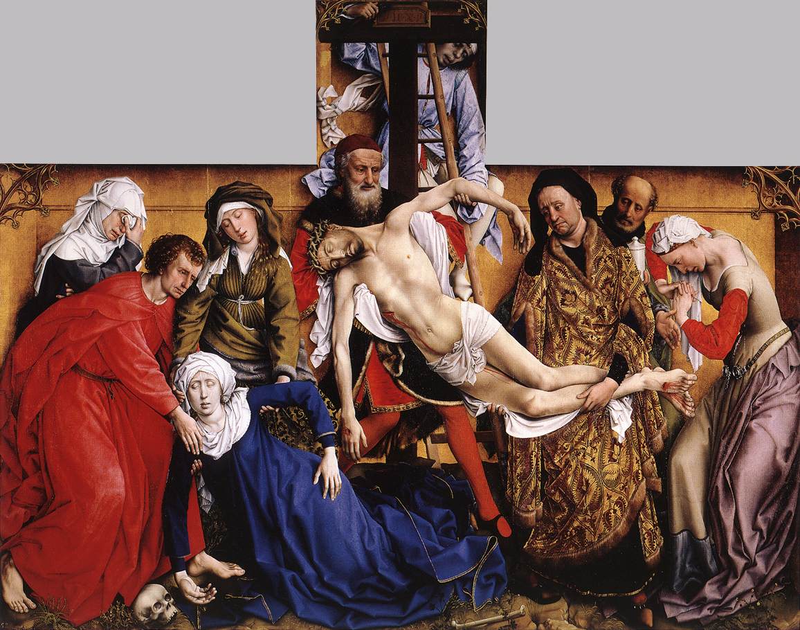
Look how Christ's body curves from His right hand, swooping downwards and through the torso, knees, then feet. Gravity makes the body sag but the artist handled the proportions of the curve so that a single line through the body unites physical suffering and emotional sacrifice. This type of expressionism can be seen in Rogier van der Weyden's Deposition:

Rogier van der Weyden, Deposition, c. 1435, oil on wood, approx. 7' x 8'6."
Museo del Prado, Madrid, Spain.


Rogier van der Weyden has taken the Gero Crucifix's simplistic, stark curve and turned the Deposition (taking Christ's body down from the cross) into a compressed, intense drama. The shading of the body and vibrancy of the oil paints (a northern European specialty) creates a jewel-toned, sorrowful and realistic menage. van der Weyden's Deposition is profound to the viewer because of the varying representations of grief: from quiet sorrow to resignation to the wringing of the hands (Mary Magdalene at the far right).

Another artistic tradition of northern European art is an intense focus on detail. In my opinion, this results from the illuminated manuscript tradition in monasteries. Illuminating a pages of the New Testament was both a way to beautify the words, increase their importance, and accrue merit with God. Here is the Chi Rho Iota (the first three letters of Christ's name in Greek) page from the Book of Kells and the carpet page from the Lindisfarne Gospels:


Chi Rho Iota page, from Book of Matthew (1:18), from the Book of Kellys, c. 800 CE.
Ink and pigment on vellum, 13 x 9.5". Trinity College, Dublin, Ireland.

Cross page, from the Lindisfarne Gospels, c. 700 CE. Tempera on vellum, 13.5 x 9.25".
The British Library, London.

Close inspection of the two pages shows how these are not just patterns but intricate and complicated interlacings of organic vegetation and animals. These are functional pages that have been turned into aesethetic objects due to religious devotion and the human urge to decorate.

During the northern Renaissance, we see artists work this type of attention to detail into symbolic elements that add to our understanding of the scene. Here is a detail from the front of the Ghent Altarpiece by Jan van Eyck and possibly Hubert van Eyck. This is an annunciation scene, where Gabriel tells Mary she is going to bear the son of God. The scene takes place ina simple Flemish interior, bringing the sacred closer to the world of the viewer. Mary kneels and by showing her readig, we notice her education and humility:

Jan van Eyck and Hubert van Eyck, Annunciation, from the Ghent Altarpiece (closed),
completed 1432. Oil on panel, 11'5" x 7'6". Church of St. Bavo, Ghent, Belgium.

This simple interior scene is rich with details. Look how far we can see into the distance through the windows:


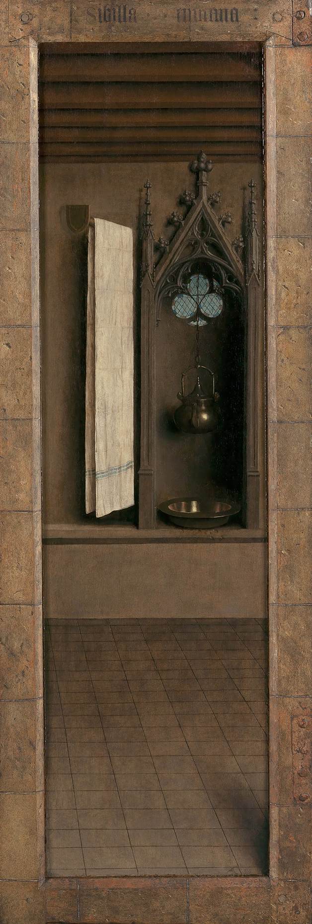
Or see how Gabriel is holding white lilies (symbols of the Virgin's purity), and a white dove is above Mary's head (the Holy Spirit). In the back of the room is a kettle and wash basin set into a niche (symbolic of the Virgin's role as maternal vessel):


Look back at the first image of the Annunciation. There are golden words coming from Gabriel's and Mary's mouths. Gabriel says, "Hail, thou that are highly favored the Lord is with thee." In return, Mary says, "I am the handmaid of the Lord ... let what you have said be done to me." These words are written in Latin, but are upside down - so that God can read the lettering!

But it is not just symbolic details that Jan van Eyck includes, but also the details of texture. He has convincingly replicated the smooth gleam of metal, the matte wood, and the folds of cloth. This is another variation of the theme "attention to detail" that we see in northern Renaissance art. So if the traditions of classicism and naturalism are hallmarks of the Italian Renaissance, then we see the traditions of expressionism and attention to detail as characteristic of the northern Renaissance.

Finally, I'd like to add that a common element to both the Italian and northern Renaissances are the artist's intent to convincingly replicate the world around him. This then implicates several areas of importance that are "reborn": a new awareness of the physical world, bringing art (that which is usually depicted is sacred, i.e., religious) closer to the earthly world of the viewer, the role of the artist as creator and recognition of talent**, and the recording of the world (art) as a way to create a spiritual experience for the viewer.

*expressionism: communicating emotion through distortion and and emphasis, and can be found in artworks of any period. Source: ArtLex.com
** medieval artists were rarely seen as "geniuses" or has having special talent, but as craftsmen who were good with their hands.

Wednesday, May 13, 2009

Genuine Fakes, pt. II

This other post discusses originality, quality, and artistry and the impact it can have on a person's viewing experience, and also an artist's legacy. At the end of the post, I introduced an element that puts tests notions of originality, quality, and artistry: the forgery, a work presented with the intent to deceive.

Art forgeries are usually plots devices in popular entertainment (see this episode of the CBS drama, "The Mentalist"). I don't really think the general populace thinks about art forgeries because most people don't think about how art is made, nor do they think about how art changes hands throughout the centuries. And in general, the art market mystifies everyone - including those who work in it. Art experts estimates about forgeries vary from 15-30% of all art on the market are fakes, and one estimate even claims up to 60%. Fakes have come in the form of antiques, paintings, sculptures, sketches, and archaeological "finds." (Check here and here for some more history of counterfeit art.) There was enough fraudulent art activity that an FBI Art Crime Team was formed to help recover stolen art and detect fakes.

How does someone become an art forger, and how does a fake get onto the market? In the case of British art forger John Myatt (in picture at left), it was a combination of financial need and an unsavory "friend." As Myatt tells the story, he was a high school art teacher with two kids, struggling to make ends meet. For fun, he had painted a few imitation paintings for friends. In 1983, he placed an ad in a newspaper that advertised "genuine fake" paintings, and was contacted by a man named John Drewe. Drewe eventually commissioned more than 200 paintings by Myatt in the style of the modern greats: Monet, Camille Pissaro, Mark Chagall, to name a few. Drewe took these works to the auction houses, and the works were put on the market - some selling over $150,000.

Myatt created the art, but Drewe faked provenance (history of ownership) and documentations. He would put them in old frames and spill coffee on the canvases to make them appear old. What shocked Myatt the most was how his blatantly 20th century materials (including intimacy lubricant KY Jelly) managed to sneak past the "experts" at Christie's and Sotheby's. According to Myatt, faking the history of the painting was easy: just go to the libraries at Cambridge or Oxford, find a book about the artist and then tell the auction houses that the painting is mentioned in there. And there apparently was very little follow-up. And Myatt kept painting for Drewe and stayed deliberately naive about where the paintings were going or where the money was from.

Myatt and Drewe got caught when Drewe's marriage fell apart. His wife called the cops. And the cops arrested Myatt and Drewe. According to prosecutors, Myatt made about about £90,000 and Drewe profited £1.5M. Myatt cooperated with authorities, and spent one year in jail. He claims his inmates called him "Picasso."

Myatt is still creating forgeries, only this time, it's a real business called "Legitimate Fakes." I briefly met Myatt when I studied at Cambridge, he was a guest speaker and taught a practicum about creating fakes. He was very lively, and funny in that dry/self-deprecating British way. What struck me as the most interesting was his disdain/cynicism for the art market and art historians. He told us all that what art historians did was "useless. If you want to get in the mind of Monet, paint like Monet. I know what went on inside his head because I've had to make all the same choices as him." Myatt did a wonderful imitation of Monet's signature; he explained to us that you can do the signature as long as he signs the back of the canvas.

(And obviously, as an art historian, I disagree with Myatt's assessment. Art history isn't really about getting into the the mind of the artist - you can't even do that for living artists! There are many different intents, functions, methods, and techniques to the discipline. But that's for another post.)

Is Myatt an artist? Is he a "good" (quality) artist? Where is his place in art history: as a forger or an artist? Can someone be both? If you find his works pleasurable to look at, does that devalue or call into question the notion of the famous artistic genius? Does it even matter, you just like what you like? Here are some comparisons of Myatt's work (on the left) and the originals (at right):

Left: John Myatt, Harlequin,
Right: Joan Miro, The Beautiful Bird Revealing the Unknown to a Pair of Lovers (from the Constellation Series), 1941, gouache, oil wash and charcoal on paper. 18 x 15".
Museum of Modern Art, New York City.


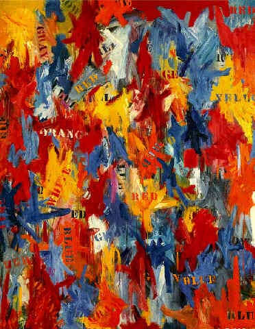
Left: John Myatt, Jasper Johns: Mixed Metaphor, 1960

Right: Jasper Johns, False Start, 1961, oil on canvas, 68 x 53".
Sold at auction in 1988 for $16M.

For curators, art dealers, auction house workers, and scholars, determining authenticity is a central concern: how can we charge millions of dollars or write hundreds of pages of research if the piece in question is a fake? It is a matter of ethics and legality. We are continually developing new technology and techniques to test authenticity. Scholars are delving into archives and painstakingly reconstructing artists' biographies so that our ideas are also authentic.

And yet, some artists make fakes, conformity and reproduction a central part of their aesthetic: Jeff Koons, Marcel Duchamp, Andy Warhol all come to mind. I'm envisioning a future where the conceptual tension arises when artists are trying to make forgeries, and forgers are trying to pass of their work as authentic. When compared to a few books based on fake works or art sales of forgeries, that seems like the worse option.

Genuine Fakes, pt. I

When discussing an artist or a work of art, originality is often cited as a key aspect to determining quality. Discussing originality can be framed in various aspects: as a daring new composition (Bernini's David), new techniques (Cezanne's edges), the willingness to be boring (Warhol), or new materials (Duchamp). Originality is what gives us goosebumps when standing in front of a Michelangelo sketch or a Picasso painting: we believe we are seeing the brushstrokes of a genius, that they touched this very canvas. Our physical proximity to the art makes us thismuchcloser to a famous genius; we are now a witness to their artistry.

An artist that is perceived as "unoriginal" can kiss his artistic legacy good-bye. For example, Dutch Baroque painter Jan Lievens was one of the most sought-after artists during his lifetime. He also happened to be a close friend and colleague (they shared a studio) of Rembrandt's. Lievens's style changed quite a bit by the end of his life due to international travel, and his late works clearly show the influence of the Catholic Flemish style. Perhaps that is why Dutch Protestant historians and critics criticized that Lievens never lived up to his prodigious talent? Or maybe Lievens's technique and handling of paint really isn't as expressive as Rembrandt? Regardless, Lievens has been a minor footnote even in Dutch Baroque studies, considered a lesser imitation of Rembrandt. The recent traveling exhibition "Jan Lievens: Out of Rembrandt's Shadow" seeks to amend Lievens reputation as a truly talented, original artist in his own right.

When discussing originality and art, there are implications of ownership and quality. (We won't even get into the notion of the male artistic genius and the female amateur practitioner.) And with these contentious issues, art historians and scholars have had their work cut out for them. For example, we have to determine who made what: artists have worked collectively in studios and workshops since antiquity. Many medieval works of art fail to capture the world's attention simply because we can't name the artists. And master artists like Raphael, Titian, David, etc. all ran their own workshops. In a workshop, the master artist runs the show: he lands commissions, creates designs and sketches, and then lets his assistants fill in the canvas. The master artist may come in to do a difficult part of the painting - some hands, or a difficult body position, or he may come in to do the most important part (the Virgin's face, the climax of action). Or for some artists, they may simply sketch in the lines and direct their assistants as they paint it. Some contemporary artists do this as well. For the general public, once learning this fact of artistic production, the mystique and grandeur of the viewing process has been lost.

What happens when we stand in front of a work of art and believe it is an original work by a genius? What happens when we find out that piece is actually a forgery? The work of art that we "oohed" and "ahhed" over is actually made by some random guy?

Forgeries are excellent tests to those who believe originality and quality are assuredly linked. A forgery shines a light on the hypocrite who fawned over the "excellent" brushstrokes and the choices made with line and color, but then dismisses the object upon learning it's a fake. A forgery that gave a person a pleasurable viewing experience forces the person to ask if the cache of a famous name was a factor in their pleasure. A very good forgery asks us to redefine who can and should be considered artists in their own right. And a forgery places the burden of proof on scholars, historians, critics, conservators, and art dealers to not only reasses an artist's entire oeuvre, but their own expertise.

Friday, May 8, 2009

What are you looking at?

Late 19th century French artist Henri de Toulouse-Lautrec (1864-1901) was born to an aristocratic family who dated their lineage back over 1000 years. Unfortunately, by the time Henri was born, the family fortune was lost and all that was left was a country home and the family name. Toulouse-Lautrec broke his legs at age 12 and 14, and his legs failed to heal properly, stunting his growth and leaving Toulouse-Lautrec incredibly self-conscious. At 4'5", Toulouse-Lautrec could no longer accompany his father on hunting trips but left him with time to draw. In the 1870s, he left for Paris to become an artist.

Because he felt women from his own social class only talked to him out of pity or obligation, Toulouse-Lautrec was much more comfortable with the Montmarte district of Paris. In the bars, cabarets, and brothels, Toulouse-Laturec found his subjects, audience, and patrons. This demimonde (French, "half world")
occupied an interesting place in the rapidly modernizing Paris: a strange type of freedom where people carouse, act, drink, dance, and gamble. Only modernization and industrialization could make this possible: people no longer had to work sun up to sun down, and Baron George Haussmann's newly renovated Paris had wide sidewalks with gas lamps so that venturing out at night was safer. And significantly, due to various capitalistic and industrial processes since the Renaissance, leisure was now a business and a commodity. It is not difficult to psychoanalyze Toulouse-Lautrec's draw to the demimonde. Among the "freaks" of polite Parisian society (which still clung to traditional social distinctions) he felt quite at home amidst the dark Montemarte nightlife with prostitutes, actors, performers, and other outcasts.

As an artist, Toulouse-Lautrec was prolific and progressive with his use of line, color, and composition. His Montemarte subjects as well as their depiction are distinctively modern. This is one of Toulouse-Lautrec's most well-known paintings:

Henri de Toulouse-Lautrec, At the Moulin Rouge, c. 1892-95, oil on canvas, approx. 4' x 4.62'.
Art Institute of Chicago. Author photo.


Actress May Milton's greenish face peers (leers?) at us from the right foreground, lit by the late-19th century stage technology that used actual gelatin screens to create colored light (now, these are plastic sheets known as "gels"). Behind her are various performers, dancers, and patrons of the Moulin Rouge - including a self-portrait of the artist (above the orange-red hair of the woman in the center of the canvas). The Moulin Rouge was described as "Vice up for auction; one could put [a sign] on the door front: 'People, abandon all modesty here.'" Several elements of this painting indicate that the Moulin Rouge isn't necessarily a happy, welcoming place: Milton's green mask-like, everyone else in the painting has their back turned to us, and the ground is unstable as it rises toward the picture plane, disorienting us like we've drank too much absinthe.

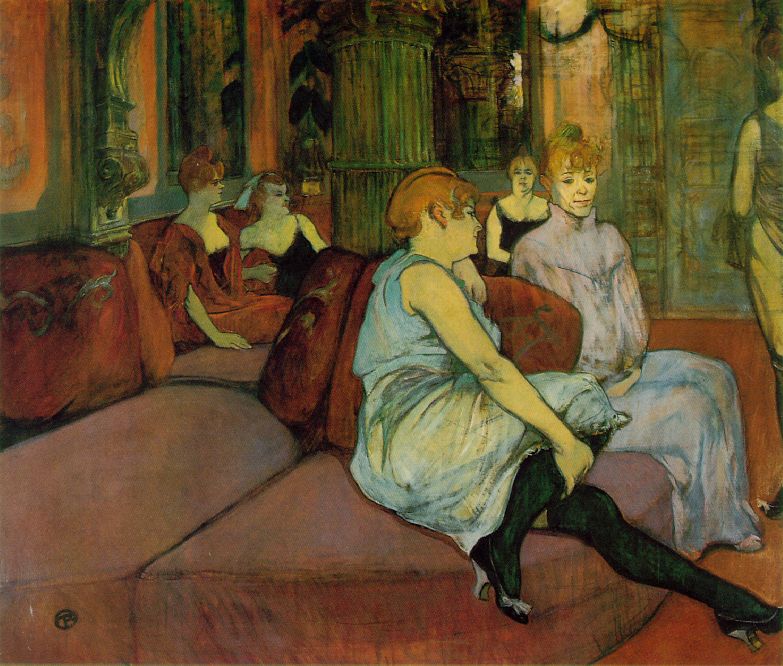
Toulouse-Lautrec's subjects include the "others" of Paris: prostitutes. In the 19th century, prostitution was seen as a major illness of modernity and urbanity, and usually the woman's fault despite sheer demand for their services. (We'll not get into the gender implications now, or the sheer number of prositute pictures from the later 19th century.) Toulouse-Lautrec preferred liasons with prostitutes : because of the nature of the job, they were all business, and there were no ambiguities about their intentions. In the 1890s, he painted more than 50 paintings of prostitutes, such as this one:

Henri de Toulouse-Lautrec, In the Salon of the Brothel of the Rue des Moulins, 1894, oil on canvas, 43 x 52". Musee Toulouse-Lautrec, Albi, France.

In one of the most expensive brothels in Paris, Toulouse-Lautrec shows the downtime in between meetings with clients. He has contrasted the slouching positions and glazed expressions with the lavish and glamorous interior design to show a side of the women that their clients do not care about. Look at the woman at the right in the long white nightdress: the straight-backed posture and the forced smile indicate the carefree woman generous with intimacy with her clients is more of a business choice, a persona, than a personality trait. In this regard, as client and sympathizer, Toulouse-Lautrec gives a more nuanced and wistful, but not pitiful, depiction.

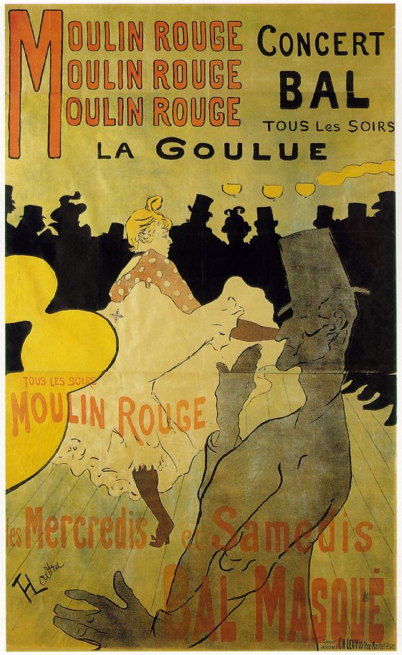
Perhaps audiences are most familiar not with Toulouse-Lautrec's paintings, but his posters for Montemarte entertainment. He created 393 lithographic posters, and are his most influential and longest-lived works. Look at these and tell me you've never seen them in a dorm room somewhere:


Henri de Toulouse-Lautrec, various four color lithographic posters, c. 1890-95.

These prints are easy to read: broad areas of flat color, and the actions and gestures of the silhouetted figures are clearly conveyed. For me, Toulouse-Lautrec's lines are the most compelling element to his posters: sinuous, confident, graphic. The way they flow up and down and around the canvas, outline forms, and still indicate handwritten script - the lines are alive and vibrant, like the nightlife they are used to advertise.

Prints are a democratic medium, and the perfect medium for Paris after a long century of revolutions, reconstructions, and socio-political upheaval. These lithographic posters were hung in the streets with the understanding that they'd be viewed by people from various social classes, occupations, genders, persuasions, and sexual orientations. By being cheap and easy to produce, the print's very construction and nature makes it an emblem of modernity: advertising, mass media, and disposable. Furthermore, the prints' function as advertisements become representative of that unique moment in human history when capitalism and culture meet: anonymous urban audiences as consumers of cultural products.

Finally, we need to consider how the spectator and the act of viewing is treated by the artist. At the Moulin Rouge has a unique tension to it because the spectator is confronted by May Milton but not acknowledge by anyone else. The diagonal railing in the lower left corner prevents us from entering the painting's space, reinforcing to the viewer, that you can watch but not participate. The casual, behind-the-scenes look at the Rue des Moulins brothel is about careful observation: seeing what others can't/won't/don't see, and the women either don't know or don't care that they are being watched. Our vantage point is odd; we are slightly above and removed from the women, but close enough so that the woman's body extends out of our view (notice how her foot is cut off at the right). The posters don't care who looks at them. Toulouse-Lautrec, retreating to the Montemarte nightlife to escape being stared at (and thus pitied or becoming a passive object of looking) has created a life and art about the implications of looking and watching.