Thursday, May 7, 2009

Intro to the Italian Renaissance

Note: Because I know Renaissance scholars are a finicky, methodical group, I'd like to clarify that I understand a few of my definitions and art choices are problematic: the lack of distinction between Early and High Renaissance art, no references to the Siena school, the simplified definition of humanism, the cursory introduction to illusionism, etc. All I can say is this is an introductory post for people who have NEVER HEARD OF THE ITALIAN RENAISSANCE, EVER. (Unbelievable, I know!)

Okay, moving on....

Quite often, the undergraduate art history survey course is divided into two sections: Ancient and Medieval, and Renaissance and Modern. Renaissance means "rebirth," from the Latin renasci, "be born again." What exactly was this "rebirth"?

Understanding the Renaissance means understanding our present historical situation, as the Renaissance is generally identified by historians as the Early Modern period. Many cultural, social, religious, technological, scientific, historical, political, and economic structures of our contemporary society have their roots in this period. In art, it is both the standard bearer for great art, and what all artists have rebelled against. And while it is generally understood that all of Europe underwent this rebirth, this post will specifically deal with the Italian Renaissance, with later posts devoted to the equally interesting Northern Renaissance.

As with the survey course, we begin with discussing late medievalism because to understand what was reborn, we must understand what was left for dead. Medieval Europe is the period after the fall of Rome through the Renaissance, and is (unfairly) called the Dark Ages. For some historians, medieval Europe shows a stagnation of learning, incredibly low mortality rates, and an unfair socioeconomic/political structure known as feudalism. (It is also the period that brings us soaring Gothic cathedrals, beautiful illuminated manuscripts, and the formations of the present-day nations.) Furthermore, this "darkness" was seen in comparison to the perceived learning, light, and progressive nature of the ancient Greeks and Romans. Both the term "dark ages" and the idealization of Greco-Roman antiquity indicate how history can be manipulated through bias.

Anyways, late medieval art in Italy looks like this:

Bonaventura Berlinghieri, panel from the St. Francis altarpiece, 1235, tempera on wood,
5' x 3' x 6'. Church of San Francesco, Pescia.


Ancient Greek and Roman art looked like this:
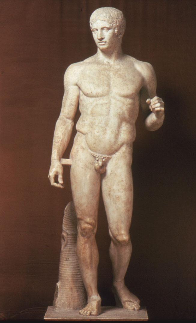
Polykleitos, Doryphoros, c. 450-440 BCE, front is 212 cm, from Pompeii.

And Italian Renaissance art looks like this:

Michelangelo, David, 1504, marble, approx. 14'3". Galleria d'Accademia, Florence, Italy.

You can see from the naturalistic volume, idealized anatomy and proportions that Renaissance art looks a lot like ancient Greco-Roman art. Renaissance artists are credited with reviving the idealized and naturalistic forms of antiquity. This revival accompanied a general rebirth of the liberal arts for the aristocratic classes, an emerging middle class, vernacular Latin dialect, and the repopulation after the Black Death that reached Italy in 1348. (For the purposes of this post, the Renaissance took place 1400-1600 but I ask that you see these dates with some nuanced understanding. People didn't wake up on January 1, 1400 and say, "Well, now we're in a Renaissance! Lets start printing books and imitating the Greeks!" Rather, the developments that came into fruition during those dates had their roots in the late medieval period.)

Most importantly, a new mindset began to take place: humanism. Human-ism. I call it the "humans first!" ideology; humans begin to start questioning their own place in the world and through the accumulation of new knowledge, begin to theorize about individual potential. To slightly stereotype the medieval mindset, people were told by the main authority (the Church) that they were lowly, weak creatures who endure lives of pain and labor, and by the grace of God, if you were pious enough, you may reach the rapture of the heavenly afterlife. To slightly generalize the Renaissance mindset, people began to ask, "really? That's the way it has to be?'

For artists, there was a new interest in representing the world as the eye saw it, and an increased artistic drive to not only depict the real world, but to make it perfect. No longer do images need to flat and otherworldly but the can be, well, real. Beauty = truth; truth = perfection; ergo, beauty = perfection, another way to achieve heaven. Artists experimented with a variety of techniques and devices that craft a real-looking appearance: linear perspective and single-light source modeling. Significantly, we start seeing idealized proportions and anatomy: humans start to look like Greek (pagan) gods. Here, Jesus has taken on an appropriately idealized, godly form:
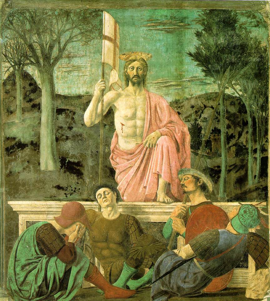
Piero della Francesca, Resurrection, 1463, mural in fresco and tempera, 7.38' x 6.56'.
Museo Civico, Sansepolcro, Italy.


And figures no longer stand stiffly. Bonaventura Berlingheri's St. Francis looks timeless, permanent; his body is concealed under his thick robe, his feet hover off the ground (only the blessed do that) and he exists in a heavenly gold world (achieved by the use of gold leaf). Piero della Francesca's Jesus looks like a proud man, and has returned to a world with realistic space, trees, and sleeping guards.

In the Italian Renaissance, sculptures exist in the same world and move the same way as humans. Here is Donatello's David, considered the first freestanding nude sculpture created since antiquity:

Donatello, David, c. 1444-46, bronze, approx. 5' high. Museo Nazionale del Bargello, Florence.

David stands in contrapposto ("counter pose"), shifting his body weight onto one leg as he contemplates Goliath's head at his feet. Contrapposto creates a beautiful harmony of opposites: one bent leg across from a straight arm, a straight leg opposite a bent arm. It is how humans stand and move through the world, letting gravity pull weight onto one leg and to compensate, the other leg bends. Art is no longer reserved for the holy and righteous; Donatello's David's small shift of the body brings the world of art back to the world of man. Hence, rebirth.

Tuesday, May 5, 2009

... we all Scream!

One way or another, we're all familiar with this image of the Christiana fjord in Oslo, Norway:

Edvard Munch, The Scream, 1893, oil on canvas, approx. 35" x 28".
National Gallery, Oslo.


Perhaps Munch's painting is familiar to you because of the many pop culture parodies and merchandise it has inspired? Here are just a few that popped up with a quick Google Image search:


This post deals with the intersection of the fine arts and pop culture: how does the latter affect the original intent/meaning of the former?

From The Scream, Norwegian painter Edvard Munch (1863-1944) is perceived by viewers as a tortured soul. We know he had addiction issues, mental health issues, and was agoraphobic. His family life was fractured - his father was strict and religious, and his mother and sister both died of tuberculosis. (A recent exhibition at the Art Institute of Chicago tackles the notion of the mentally-ill and tragic artist.) About The Scream, he wrote,
"I was walking along a path with two friends - the sun was setting- suddenly the sky turned blood red- I paused, feeling exhausted and leaned on the fence - there was blood and tongues of fire above the blue-black fjord and the city - my friends walked on, and I stood there trembling with anxiety- and I sensed an infinite scream passing through nature."
Munch's Scream exists in several paintings and prints. Each piece shows a man clutching the sides of his face in the foreground while standing on a bridge, and two figures in the background. The triangular shape and composition of the bridge dislocates the viewer: there is plenty of space for the man in the foreground, but the bridge looks "fast" - the diagonal of the bridge races to the back left corner. The bridge's ground pushes toward the picture plane. Munch's wavy lines of the man are echoed in the lines/shapes of the colors in the sky as the scream (heard inside the man's head?) fills the his psyche and the external environment. The viewer is left with the impression that the man is psychologically and physically compressed.

Munch denied that his work referenced Nietzsche's own theory about the scream. Research about the geography of Oslo shows that in this particular area of Oslo included a slaughterhouse and the mental institution where Munch's sister, Laura, was housed. Sue Prideaux reports in her biography of Munch that "the screams of animals being slaughtered in combination with the screams of the insane were reported to be a terrible thing to hear." The Scream takes on a new dimension of psychological, biographical, and visual intensity when we consider this fact.

The Scream's appearance lends itself to pop culture imagery because of its efficiency: the elongated and wavy lines, the gesture and expression of the man, and the dizzying diagonal of the bridge - all these elements instantly conjure a moment of a terror. And late 20th century pop culture imagery, based on the modes of mass marketing, demands an image where the physical appearance instantly conveys a message. Constant reproductions and parodies like the ones posted above are the equivalent of an art history shortcut - no need to know the original, we get enough from the parodies.

How do processes like reproduction and parody affect our understanding of the original? I'm guessing that most audiences don't know Munch, his writings, or his biography. I wonder if audiences would feel like they need to know any of that information when the image, as noted earlier, is compact in its presentation of emotion. Or to viewers out there who were only familiar with The Scream's pop culture references: does The Scream take on a new, significant dimension when learning a bit about the history of the art and artist? Or does The Scream have, to quote Mia Fineman, a "correspondingly fall in gravitas" when looking at the parodies/reproductions? Is a keychain of The Scream somehow disrespectful to the original work of art or Munch?

For me, I'm unresolved. I'm mostly interested in the broader themes raised by this discussion: the distinctions drawn between fine art and pop culture, the role of the media/marketing in creating a mass consciousness of an image, and the distance between the original work of art and future viewers. In many ways, the durability of a work hinges on its ability to be relevant to future, anonymous generations. And in this regard, The Scream has become relevant via the reproductive mechanisms of mass media and capitalist consumerism. The Scream has produced endless amounts of scholarly writing, research, and history so that anyone who wants to learn more will be able to do so. Does Munch deserve better? Probably, but we can't control who steals your image - for a necktie, or an actual art heist. At the very least, those who care about art and write the history will try to be objective and fair to the artist and his work.

Monday, May 4, 2009

New Art City by Jed Perl

Contemporary American art critic Jed Perl’s book, New Art City (2005) presents mid-century New York City as participant, catalyst, and grand stage of Abstract Expressionism. Using quotes, memories, photographs, literature, and critical writings of the period, Perl invokes the cultural and intellectual milieu that fermented throughout downtown New York City. The result is a narrative of cultural and historical conditions that, according to Perl, inevitably lead to America’s greatest contribution to modern art. It is a story of heroes, antiheroes, big ideas and villains, all contributing to the artistic landscape spanning from its foundations in the 1930s through the repercussions in the late 1960s and 70s. In addition, Perl acts as cultural and urban geographer through his exploration of the now-legendary places of Abstract Expressionism, such as artists’ studios, the Cedar Tavern, the Museum of Modern Art, the Solomon R. Guggenheim Museum, and the City itself.

Perl’s 557-page book, not including notes and endnotes, is organized into five sections with each section consisting of 2-4 chapters. The book proceeds chronologically, beginning with painter Hans Hofmann, a German émigré who ran a legendary studio school beginning in 1933, and ending in the mid-1970s with Minimalist sculptor Donald Judd and painter Fairfield Porter. Using these artists as bookends, Perl's narrative begins with the introduction of the European avant-garde to American artists, the ascent of the American art scene alongside the promotion of American-style modernism, and a "descent" into ironic conceptualism. Perl loves that the United States took center stage after WWII: "What was clear to just about all the artists was that the ball was in New York's court. The grand old themes now belonged to Manhattan. These themes included the artist's relationship with society; the struggle to define and redefine quality; and the place of meaning in art, and especially, now, in abstract art." Art historians will recognize the validity of this statement and also appreciate the romanticism it implies.

Perl asks, “If the New York artists were dialecticians first and last- instinctive students of the histories of style, which they spliced and diced, accepted and rejected- who can wonder that collage itself and the image of New York as a grand collage were so dear to their hearts?” The introduction of a facet of the city's geography or personality then connecting it to the artists and art of the time is an effective technique. In a very accessible (and still high-brow) manner, New Art City is a study of the metaphorical spaces and communities within an urban context.

This structure allows Perl to support his thesis that the relationship between the city and artist results in extraordinary American art, as well as an effective way to capture the zeitgeist. New Art City overlaps people, places, ideas, quotes and memories trying to recreate this heady cultural milieu, the diverse ideas and people and reactions and relationships, in order to give context to the revolutionary ideas and art that from it. About the legendary Cedar Bar where the Abstract Expressionists would meet/drink/argue/laugh, he quotes the diary of actress and director Judith Malina:
"[The opening of the Ninth Street show] was a great splash. Some wonderful painters have rented a large loft, painted it white, and hung hundreds of canvases in the bare rooms. We seek relief from the intense night heat outside, under the sign painted by Franz Kline, lit from the window of a studio across the street. I talk for a long time with John Cage about painting and music ... After the exhibit there's a party at the Three Arts Club ... Clement Greenberg jitterbugs violently to Louis Armstrong's 'I Ain't Rough.' Sidney Janis jitterbugs conservatively and does a very suave tango."
This is a recollection of America's foremost modernist art critic (Greenberg), one of the most influential art dealers in the 20th century (Janis), a ground-breaking composer (Cage), and an Abstract Expressionist painter (Kline), all in the same place at the same time. The city is the grand stage and catalyst for the art, and New Art City is clearly a love letter to Manhattan and what Perl calls "the Silver Age."

Perl's prose uses winding sentences to impress upon the reader the force of the heady, "anything is possible" moment of 1950s and 1960s NYC. His words become long sentences, turning into incredibly rich descriptions of not only the artist and art, but the city as well. This writing style (re)creates a once-in-lifetime cultural zeitgeist. For example, he writes about assemblage artist Joseph Cornell and sculptor David Smith,
"David Smith is an alchemist. Whether he works with brand-new sheets of stainless steel or with the exquisitely forged iron tools abandoned in an Italian factory, he is a master of poetic possibility, removing materials from their ordinary contexts and giving them a metaphoric sizzle. Both Smith and Joseph Cornell, in their very different ways, offer lyric variations on life's hurly-burly. Their relationship with the city is so intuitive as to sometimes feel uncanny, and that feeling is only underscored when we consider that the very locations where they worked in New York had been given, well before they arrived, names that suggest the stamp of their personalities. Everybody who has ever thought about Cornell has noted the serendipity of his having lived on Utopia Parkway. As for David Smith, born three years after Cornell, in 1906, he had a similarly propitious encounter with a certain name in the borroughs of New York, this one on the Brookly waterfront, where the artist and his wife, the sculptor Dorothy Dehner, one day in the fall of 1933 came upon what Smith described as 'a long rambling junky looking shack called Terminal Iron Works.'"
In this excerpt, we see how Perl merges artistic sensibility with the personality of the city. For Perl, Joseph Cornell's meticulously created boxes are a way of heroizing minutiae - the discarded and overlooked that can be found in the streets (literally, gutters) and the hole-in-the-wall stores where one can find personal gems. Cornell's boxes are personal artistic expressions and also metaphors for someone trying to make sense of the endless visual sensations a person encounters in a lifetime. Smith's metal sculptures parallel NYC's skyscrapers used as proof of modernity, democracy, daring creativity, heroism and capitalism: the steel aesthetic. Smith's sculptures can be metal drawings or solidly-balanced geometrics. Collectively, Smith's pieces are now collectively known as Terminal Iron Works due to their durability (in this case, the permanence of the medium and also their visual appeal).

Perl's strength is his very clear prose: he has a beautiful way of describing the art and also describing the milieu. His descriptions, in my opinion, are dead-on and he has a lovely way of evoking not just what the art looks like but how someone looks at it. Of one of my favorite artists, Ellsworth Kelly, he writes of Kelly's "hyperbolic simplicity." Look at this or this or this or these panels at the Art Institute of Chicago:


Author photos of Ellsworth Kelly's Chicago panels, taken in April 2009.

Now, tell me that "hyperbolic simplicity" isn't a wonderful way to describe the individual works as well as Kelly's aesthetic.

New Art City is a modernist narrative because there are clearly heroes and villains. There is no postmodern ambiguity - only the sincere, modernist belief that individuals can achieve great things. Perl's heroes are the great American modernists but he clearly has his preferences: Willem De Kooning, Cornell, Kelly, Clement Greenberg. Marcel Duchamp is posited as the villain of Perl's story because of his Dada art and spurious, needling ideas about low art. At times, Perl's story lags when it seems like an endless amount of anecdotes and name-dropping, but if you're an art history junkie like me then the stories may also enthrall you.

If you are interested in reading more of Perl's work, then check out his his art criticism at The New Republic.

(Post adapted from my GoodReads.com review.)

Saturday, May 2, 2009

Juan Sanchez Cotan's Still-Lifes

Full disclosure: I'm a still-life junkie. From flower pictures to laid tables, I never tire examining how an artist mixes realism and aesthetics. The history of art is sometimes told through the grandiose, magnificant, and tragic but the history of man can be told through the things with which he surrounds himself. In my mind, still-lifes are the ultimate "art for art's sake" genre because it allows you to mix flowers and foods from different seasons, you can be ahistorical and impractical all for the sake of beauty and composition.

Spanish Baroque painter Juan Sanchez Cotan (1561-1627) painted some of the most compelling food pictures. In 1603, he became a Carthusian monk and most of his paintings date before his entry into monastic life. His best known picture is Quince, Cabbage, Melon, and Cucumber:

Juan Sanchez Cotan, Quince, Cabbage, Melon and Cucumber, c. 1600, approx. 27" x 33.5".
San Diego Museum of Art.


Cotan's still lifes take place in stage-like setting, most likely a cooling window found in Spanish homes. Foodstuffs were placed in this window so that cool air rushes over the food, keeping it fresh. Scholars debate whether this space is a cantarero or a dispensa. Both serve the same function though the latter is found in the cellar.

I often look for "entries" into a painting; here, our entry into the painting is the cucumber and melon slice. Each of these objects hangs over the ledge and brings us into the space. Cotan's pictures invite contemplation. He draws us in with the black space, the depth of the color preventing our eye from moving into the space and beyond the objects. Once our eyes adjust and recognize the forms, we start noticing how the individual textures of each object. The bright light from outside the canvas highlights every fold, crevice, and bump. And because of this light, each object gradually changes color - notice the cucumber's transition from light spring green to a darker, murkier olive. The sharp, nearly-white peach of the melon's flesh becomes a dark orange in shadow. The black background, the piercing spotlight from outside the canvas- from our space, the meticulous rendering of texture - this is food treated as theater. Visual tension arises from the simple foods and the dramatic presentation.

Cotan's composition is fabulous. The quince and cabbage are suspended in air by strings, a technique for retaining freshness. Cotan hangs them from different lengths, creating a curve spanning from the upper left corner to the lower right. Our eye travels over this parabolic curve in a swoop, and then with the cucumber, we begin the close looking of texture, light, and color. Overall, I love how Cotan's startling design balances form to space to color. It is asymmetrical but still harmonious.

Cotan utilizes the same window-stage setting in most of his paintings. Here is a photograph I took at the Art Institute of Chicago. It is a bit more crowded, but Cotan retains the same compositional structure and light treatment:

Juan Sanchez Cotan, Still-Life with Fowl, c. 1600-1603, 26 11/16" x 34 15/16".
Art Institute of Chicago


Details of the Art Institute painting:


Originally, art historians understood Cotan's still lifes as humble displays of food consumed by lower classes. However, University of Wisconsin-Milwaukee professor Kenneth Bendiner points out that in 17th century Spain, all social classes ate cooked foods, not raw ones. Cotan, presenting food in its original state, invites us to look at what is overlooked - food before it becomes a meal.

As our eye studies Quince, Cabbage, Melon, and Cucumber, we may notice how the curve of the melon slice is the same parabolic compositional curve turned almost-but-not-quite perpendicular to the picture plane. Or we might look at three round forms balanced against two elongated ones, which balance the negative space in the upper right quadrant of the canvas. We may even wonder what type of meal can be composed of a quince, cabbage, melon and cucumber. And then we realize we've been entranced by this painting for several moments, musing over foods, meals, technique, presentation, all because of "just" a food painting.

Sources: Kenneth Bendiner, Food in Painting: From the Renaissance to the Present, London: Reakton Books, 2007.

Friday, May 1, 2009

Clueless about Monet?

Cher: She's a full on Monet.
Tai: What's a monet?
Cher: It's like a painting, see? From far away it's okay, but up close it's a big ol' mess.

While this is a pithy dialogue excerpt from a great 90s movie, it is also a good starting point to discuss an Impressionist painting. For most people, Claude Monet (1840-1926) is the most recognizable name associated with French Impressionism, an outgrowth of the Realist movement. (Future posts will be dedicated to Realism, and also how Impressionism is also realism.) Here is his painting that led a critic to coin the term "Impressionism." It debuted in 1874 at what is now recognized as the first Impressionist exhibit:

Claude Monet, Impression: Sunrise, 1873, oil on canvas, 19 5/8 x 25 1/2 inches.
Musee Marmottan, Paris.


As Cher notices, from a distance it is easy for us to see Impression: Sunrise as a three-dimensional view of Port Le Havre. However, a closer inspection of the canvas shows how Monet left his brushstrokes unblended so they rest, quite visibly, on top of the canvas surface:


Impression: Sunrise was shocking and crude to the 19th century eye. This is more apparent when looking at the highly-finished Academic canvases like this one, which debuted to critical acclaim at the Salon of 1874:

William Bouguereau, Nymphs and a Satyr, 1874, oil on canvas,
9'3/8" x 5'10 7/8".
Sterling and Francis Clark Art Institute, Williamstown, MA.


Bouguereau's classical subject, large size, inclusion of nudes, and the naturalistic style were all the hallmarks of the conservative Academy's tastes. In contrast, Impression: Sunrise defiantly rejected the Academy's expectations. The canvas is relatively small (19 1/8 x 25 1/2 inches), and landscapes were viewed as impromper subjects for ambitious painters.

Most insulting to critics were Monet's brushstrokes because they weren't paint pretending to be flesh or water, but just boldly declaring their material as paint. Monet uses paint to suggest the changing light and and atmosphere at sunrise, and anyone who has seen the moment when a sun bursts on the horizon knows how quickly the phenomenon happens. As the viewer, we get the sense that the artist is working very quickly to capture that specific moment; notice how the speed of the artist's hand is indicated by the direction of the brushstrokes, and the distance in between the individual strokes. Suddenly, the brushstroke becomes a vehicle to capture not just the physical appearance of a scene but also the artist's gut response to visual sensation. In that regard, Monet's brushstroke is complex because it is both objective and subjective.

The total effect when viewing Impression: Sunrise is that we expect a three-dimensional representation of a real place, but the brushstroke prevents our eye from sinking into illusionistic three-dimensional space. In other words, we want to see a "real" view but the blatant marks on the top of the canvas deny any recessive space. This effect is what art historians and critics call "visual tension." The brushstroke is our entry into the painting, and also what prevents us from seeing anything but a flat surface. For some critics and historians, a defining characteristic of modernism in any artistic medium (poetry, sculpture, etc.) will be evidence of the creation of process, and the self-referentiality of the medium. The visual paradox of an Impressionist painting lies in visual and mental tension: knowing that it is a finished product vs. the sketch-like appearnce; the desire to see Impression: Sunrise as a three-dimensional view but being acutely aware of the two-dimensional nature of the canvas.

However, we know this because of our retrospective perch in 2009. At the time, 19th century writers couldn't handle Monet's style. Critic Louis Leroy dismissed it as "wallpaper in its embryonic state." To critics, it looked like an oil sketch but Monet indicates the finished status by signing and dating the lower left corner. It was perceived by Leroy as a slap in the face to 400 years of artistic development that stressed modeling, line, and perspective.

Finally, Bouguereau's Nymphs and a Satyr offers a safe, objective view of the subject. To 19th century critics and Salon-goers, the artist's intelligence is implied through this restraint and objectivity. By comparison, Monet's Impression: Sunrise is a sensual plunge into atmosphere, light, color, and tactility. The durability (lasting appeal) of Impression: Sunrise hinges on Monet's ability to let the 21st century see what he saw, to feel what he felt as he painted the Port of Le Havre.

Thursday, April 30, 2009

"It looks like a first grader made it."

Jackson Pollock, Autumn Rhythm (No. 30), 1950, enamel on canvas, 8.75' x 17.25'. Metropolitan Museum of Art, New York. Photo taken from Google.

Top 3 complaints about art made after 1890:
  1. "It looks like a first-grader did that!"
  2. "What does it mean? How can it mean anything if it doesn't look like anything?"
  3. "I like art that looks like time and effort when into making it."
What these comments indicate is that people who will admit to knowing nothing about art or art history already have preconceptions about art's function, intent, and appearance. Art needs to "look" like art, it must communicate some kind of definitive message, and that it requires some kind of evidence of labor. But where do people get these types of ideas? What is it about modern art that makes people so suspicious?

In my experience, when people hear "art" they think of something heroic like this:

Jacques-Louis David, Oath of the Horatii, 1784, oil on canvas, 10'10" x 14'. Louvre, Paris.

Or they expect something extraordinarily "real" looking, like this:

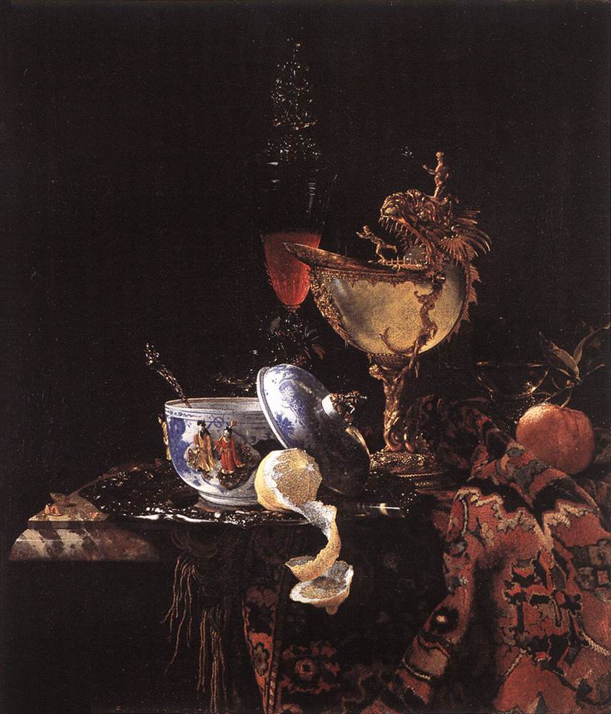
William Kalf, Still-Life with a Nautilus Cup, 1662, oil on canvas, 31" x 26". Museo Thyssen-Bornemisza, Madrid.

Or, they want something that has symbols that, once understood, enrich our understanding of the scene. (White lilies = Virgin's purity, for example):

Robert Campin and assistants, Annunciation, central panel of the Merode Altarpiece, 1427, oil on wood, 25 1/4" x 24 7/8". Metropolitan Museum of Art, New York.

So once a person is presented with a piece like Jackson Pollock's Autumn Rhythm, the initial response is suspicion. How can something like that "mean" anything? And it doesn't look like it took any effort or talent to make it! Worse yet, the extraordinarily cynical 21st century mindset is that someone is out to make them look foolish by not "getting it," or that Pollock was out to make a quick buck the easiest way possible.

Here, I'd like to address from where people's ideas (misconceptions, really) stem. Subsequent posts will address the complaints introduced at the beginning of this entry, and then someday, we'll discuss Pollock.

Everyone remembers someone from K-12 that was considered a great artist. This would be the person who won the class contests for No Smoking campaigns, the person's whose lecture-time doodles were remarkably naturalistic, or the person who was voted "Best Artist" during high school. This person always created art that was recognizable - their apples looked JUST LIKE apples, for example. Your apples never looked like real apples, and despite how hard you tried, you never won the elementary school poster contest. The rewards this person garnerned (Best Poster, Best Artist, etc.) led you to conclude that art needs to be a pretty good imitation of real life for it to be considered "good."

No matter that the fourth grade teacher who chose the winner for the poster contest has no artistic background whatsoever, and that the same people who voted for "Best Artist" are the same losers who prevented you from RSVP-ing for your high school reunion.

Then, your pop culture consciousness becomes more acute. You notice that in movies/tv, the pretentious and elitist people hang out in strangely clinical art galleries, work in auction houses, and wear funky eyeglasses. These people say things like, "This really conveys the alienation the artist was feeling at the time. So existentialist yet hopeful" while standing in front of a terrible piece of abstract art. This made you feel bad because you didn't know what existentialism was, and you didn't know how someone could "see" it in the painting. The show Law & Order is especially guilty of this stereotype. These black-clad losers are usually somehow made out to be the fool - they didn't know that the suspect was an embezzler! - and then another seed is planted: modern art appreciators may "see" something in a bunch of squiggles, but they are also tools. And you, sir, are no tool.

Plus, in college, you hated the art students. They smelled like a weird combination of cigarettes, turpentine, and sandalwood. They were losers who weren't very articulate in explaining their art and "what it means." Plus, you were suspicious of anyone who didn't major in anything highly practical like political science or physical therapy. Maybe you took an intro art history class for your humanities requirement and it killed your GPA. All in all, your life has been just fine without art and you don't need or want it. Anyways, you prefer black-and-white photography ever since you saw a coffee table book about Ansel Adams.

And then finally, you read in the news about the latest art auction. A "masterpiece" like this was just sold for $72.8 million:

Mark Rothko, White Center (Yellow, Pink, Lavender on Rose), 1950, oil on canvas, dimensions unknown. Private collection. Sold by Sotheby's in 2007.

This pisses you off. You work REALLY HARD at your job for not nearly enough money, and some white guy who committed suicide someone still managed to make more money than you'll ever see in your life. "WHAT?!" you screech, "that doesn't look like anything!" And you remember your crushing defeat in the fifth grade JUST SAY NO poster contest and before you know it, the words come rushing out of your mouth: "It looks like a first grader made that!"

In this little narrative, I've managed to touch on when/how people come into contact with art: primary school, pop culture, college, and the media. At no time was there any type of thoughtful inquiry or insight into the production, history, and reception of art. Admittedly, this type of information is rarely introduced at the K-12 level, and as my earlier post indicates, there are some real problems with the survey course at the undergraduate level. The only time the mainstream media discusses art is is to exclaim "look how much this PAINTING fetched at auction" without explaining the history and technique of the object, or explaining the mechanisms of the bloated/weird art market. And sadly, there are some really inarticulate/pretentious people in art who like to pretend that only a privileged few can truly understand art. (FWIW, these people usually feel that way as a defense mechanism to those who tell them that their beloved art "looks like a first grader made it. Or they're tools.) So it isn't really surprising that the average person doesn't really know where to begin when to look at a work of art.

So before this blog can go any further, I ask of you, dear reader, to examine your own views about art: What comes to mind when you think "art"? Where did you get those images or ideas? What types of experiences have you had with art? How much do you really know about the production, history, or reception of art?

And then, once you've thought about your own biases and preconceptions, we can start discussing art with an open mind.